Colour
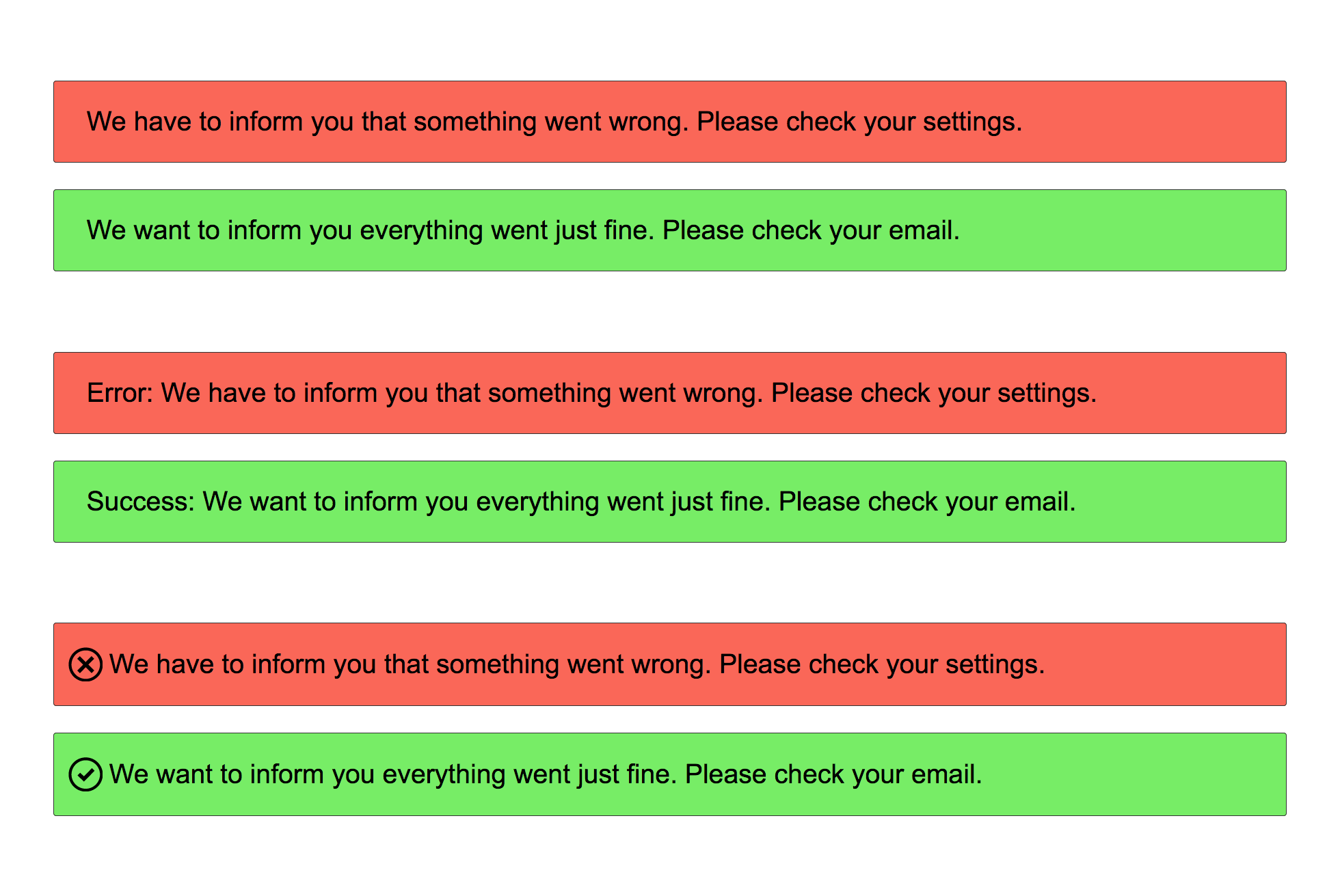
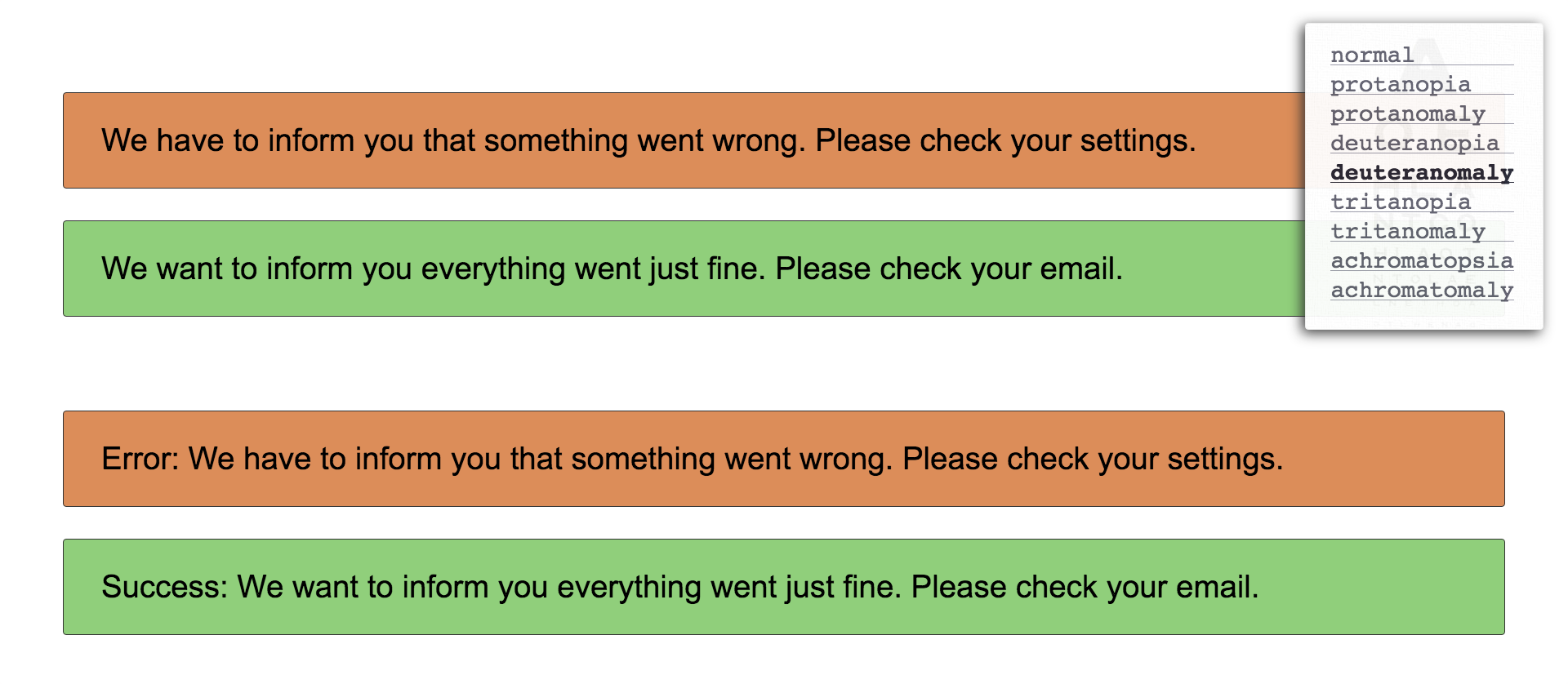
Up to 9% of the male population has some form of dyschromatopsia. They don't see red, green or blue in the same way everyone else does. Sometimes more, sometimes less intense. This gives rise to the following advice: Don't rely on colour alone to communicate. Do you think green is a good background colour for a success message? Everyone understands green after all. Wrong. Same goes for red. You should combine colour and - for example - iconography. So in our example that could mean you'll combine the green background with a happy smiley icon or a thumbs-up icon, just as long as it’s something that indicates a success or positive feedback.
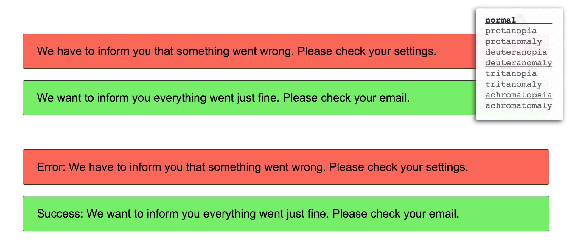
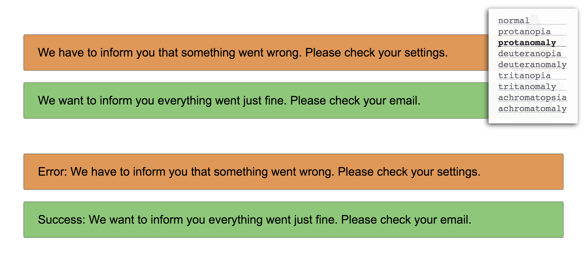
Do you want to see what people with dyschromatopsia see? There are plugins for your browser, like e.g. I want to see like the colour blind for Chrome. In that case you can check your page, but it means your page is already up and running.
What about testing during the design process?
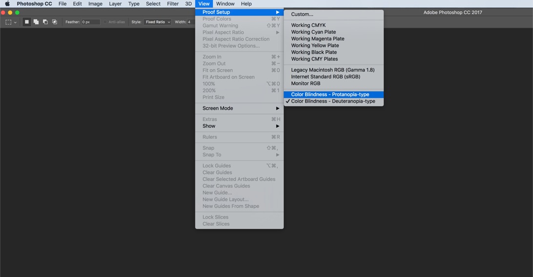
Good news for Photoshop users: Just go to View > Proof Setup > Color Blindness where you can activate one of the two filters to see how your design looks to people with different types of colour blindness.
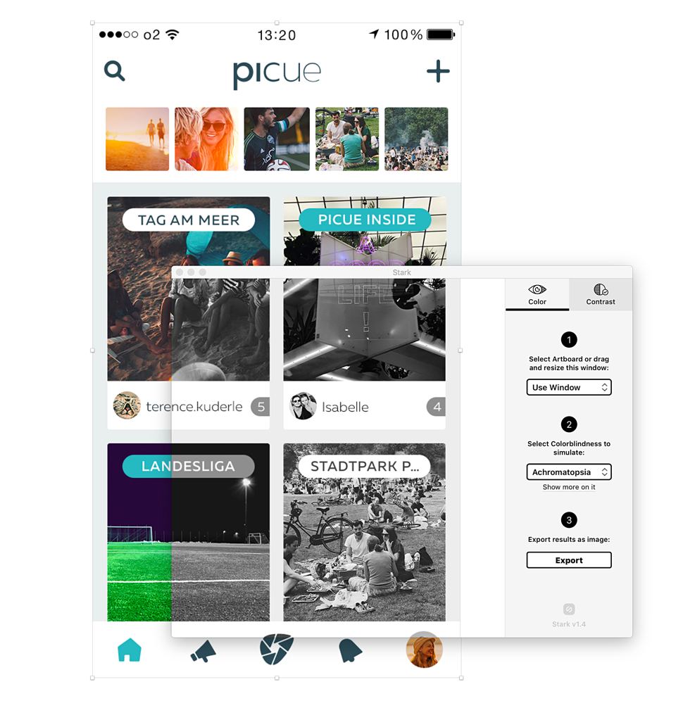
If you're using Sketch, you can add a plugin like Stark and now you can check for different types of colour blindness as well. You can even check for different kinds of colour blindness. Go to Plugins > Stark > Simulate Colorblindness > ... Stark can also check the contrast of two layers (background and foreground). That’s very handy!