Contrast
It doesn’t matter whether you're old and your eyes don't work properly any more (remember: even if you're young right now - you will get older and eventually reach that point, too), or you have a medical condition that weakens your sight, or you're just standing in bright sunshine and can't read the display on your mobile - what we need is contrast.
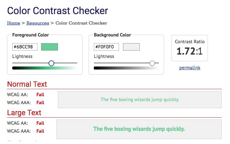
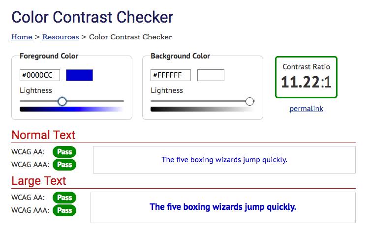
Yes, it’s nice to have a thin font, in light grey on a white background. But not everyone will get the beauty of your composition because they can't see what's written on the screen. Always remember to provide enough contrast between your copy and your background. There are online tools that can help you to find out whether your design has enough contrast or not. Have a look at the Color Contrast Checker. Fill in your foreground and your background colour, and the tool will provide you with results based on the WCAG standards AA and AAA for normal and for large text. Don't think about how they calculate the results, just pass the test and you're on the safe side.

