Color scheme
There are several reasons to change the appearance of your operating system. Recently it became "cool" to change the often bright interface of a computer to a darker one. You know what I'm talking about, engineers. You like your dark themed editors.
But aside from this trend, people sometimes really need to change from bright to dark on their computers. People may be sensitive to light, e.g. photophobia sufferers. This hypersensibility to light can be permanent or even triggered temporarily if someone. has a migraine. Either way, people will change the brightness of their devices as and when required.
On Windows 10 you can switch to dark mode. With macOS Mojave 10.14 it's also possible to choose a dark mode. Windows goes really dark (see the picture below), while on macOS it’s more of a trendy move, much like applying a dark theme to your editor of choice.

By turning on the dark mode on macOS you’ll get dark interfaces. But when you surf the internet you'll still see a lot of bright and white pages. What’s the point of a dark mode if you're sensitive to light but the main area of your browser beams like a torch?
Introducing dark mode for web pages
Sure, we could all create dark themed pages now. On the other hand ... don't. Instead, we should do both. Let's run our bright themed page and also offer the option to go dark. Back in the early 2000s we had a button – mostly at the top of a page – to switch from bright to dark mode. Sometimes there was even a theme with yellow text on a blue background. Needless to say we can do better than that.

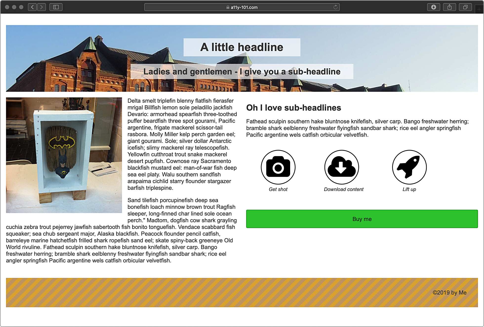
Let's have a look at this very, very simple page. It's "normal", meaning we see a lot of white. White means bright and bright might hurt the eyes of our users. That's why they've turned on dark mode in macOS.

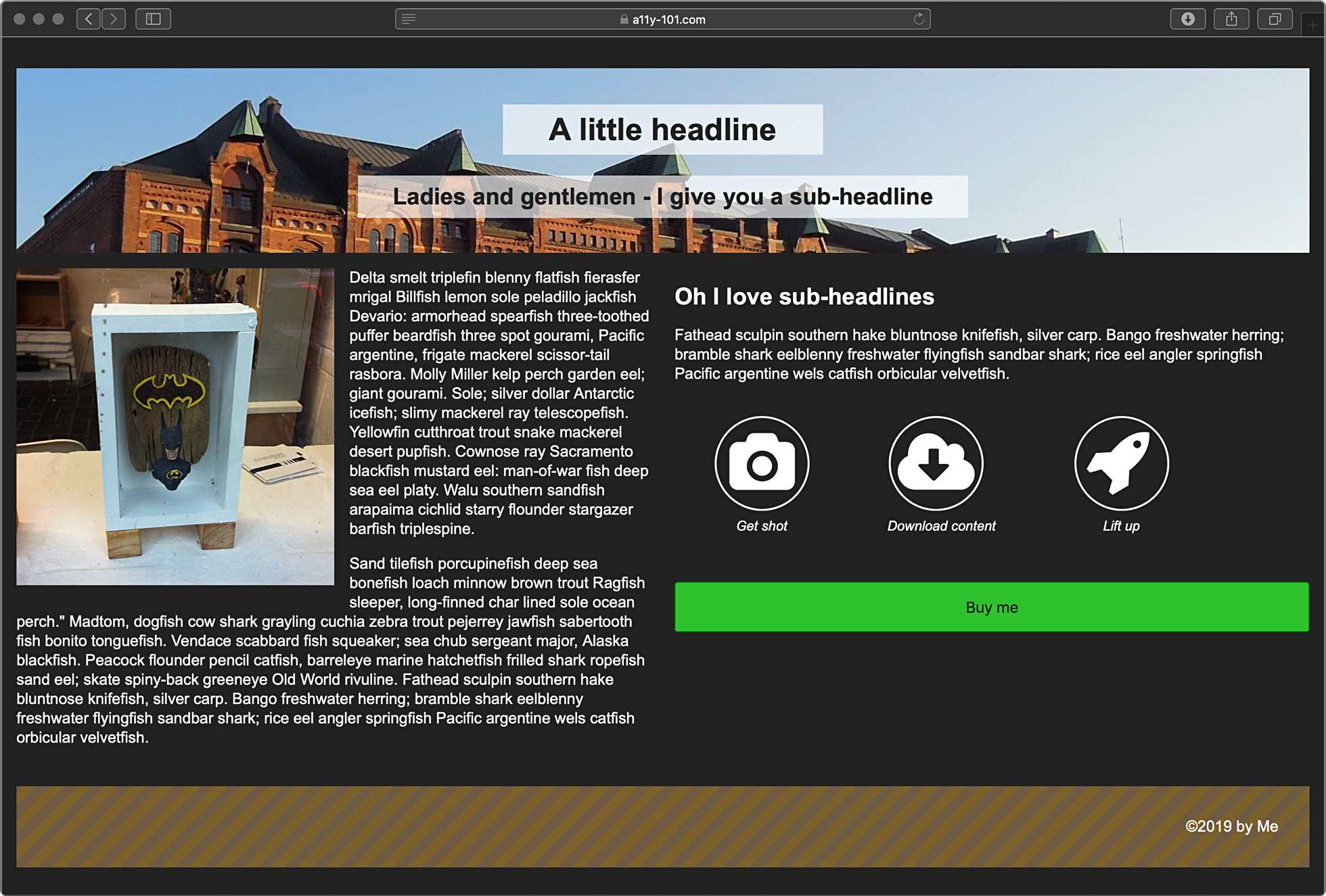
Now the interface itself is dark, but the page is still bright. This is where a media query comes to the rescue and it's called prefers-color-scheme: dark - it's similar to the prefers-reduced-motion: reduce that we've already talked about previously.
Let's throw in some "dark CSS" to our CSS and see what happens:
@media (prefers-color-scheme: dark) {
    body {
        background: #222;
        color: #fff;
    }

    svg {
        fill: #fff;
    }

    circle {
        stroke: #fff;
    }

    .header__headline--background {
        color: #222;
    }

    footer {
        background: repeating-linear-gradient(
        -45deg,
        rgba(188, 147, 96, .5),
        rgba(188, 147, 96, .5) 10px,
        rgba(215, 161, 46, .5) 10px,
        rgba(215, 161, 46, .5) 20px
    );
  }
It’s not that we've just reverted the background and the colour. In our example we have some SVGs, too. They’re black. And let me tell you, a black picture on a black background is just not cool. That's why we have to address the SVGs as well. And since my "normal" footer was too bright on a black background, I've reduced the opacity a little and it doesn't hurt the eyes so much.

prefers-color-scheme: dark is a very slick method to serve dark themed pages to people who tell their OS to be darker. Currently, it only works in Safari 12.1 (as of April 2019), but it will be supported by Firefox from version 67 on (release scheduled for May 2019).
Oh, and the opposite of dark is? Yes, you guessed it — it’s prefers-color-scheme: light.