Carousels
Designers and clients love carousels. They put image after image into these things because they want to sell as many products as possible. At the same time the question whether we should use carousels can be simply answered with no!
.
I think carousels are like ads - the user will block them out. Yes, there’s something moving up there, but who cares? Most of the time carousels are triggered by JavaScript to rotate on their own. And that might cause a problem.
Screen readers get confused. The controls are often not accessible. Important information is placed on images although we already talked about why this is a bad idea. The rapid changing of the images can also cause seizures.
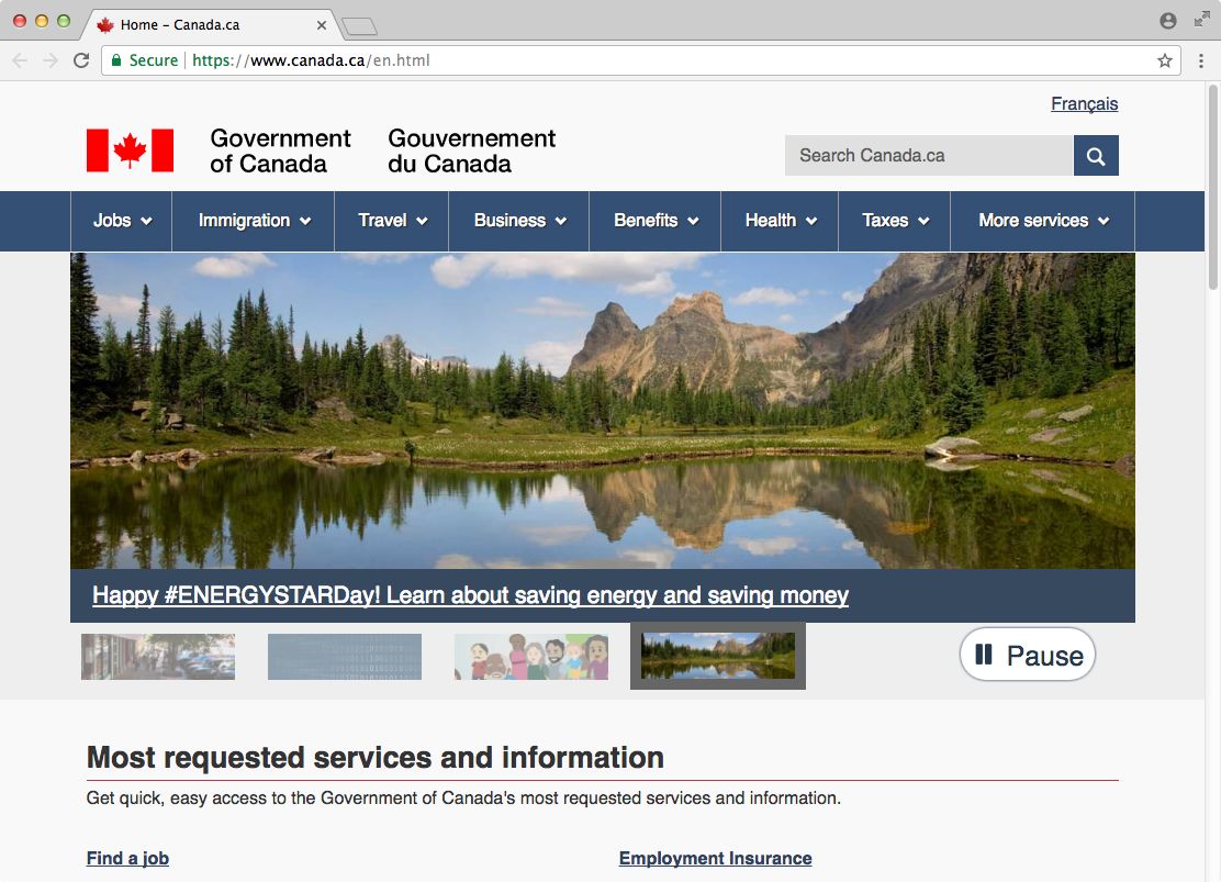
How do you avoid this? Don’t use carousels. But if you lost the fight against your client and have to implement one, at least let the user control it. The Canadian government does it right. They have a big carousel at the top of their page. Here’s what they did well:
- The time between two slides is long. The user can fetch all of the information on the slide.
- Every slide is made up of an image and a well-placed and emphasised link at the bottom.
- There is a preview of all upcoming slides at the bottom of the carousel. That way the user can directly jump to a certain slide. Let the user know how many slides there are. (By the way - there shouldn’t be more than five slides in a carousel.)
- Finally, the user has full control over the carousel. In the right corner there is a big pause button.