Aria-disabled
We all know the disabled attribute. In most cases it’s used on a button. You could have a form with a button at the bottom. This button should be disabled as long as all forms haven’t been filled out. It will look like this:
<button type="submit" disabled>Submit</button>
The disabled attribute often appears a little bit dimmed or transparent. Of course you can style this as well. Either way, sighted users will get some sort of visual feedback that he/she is not able to click on this button. A click on this button will do no good. Actually it does nothing at all. It’s inactive.
And what about visually impaired users? They don’t get any feedback at all. By using the tabulator key and navigating within a form the screen readers will ignore the existence of any disabled button.
Now close your eyes and imagine the screen reader reads out all the inputs of a form. You know you're within a form. And normally a form gets submitted by hitting a button. But our form depends on the fact that every input has to be filled out - or something else has to happen before it can be submitted. Thus we disable the button until all the conditions have been fulfilled. All sighted persons will get it. The button is semi-transparent. But when a screen reader doesn't ever reach the button, then he will never indicate that there's a button.
In this case we can use an aria-disabled="true" instead of the good old disabled.
Video example
This video shows the difference between aria-disabled and the "normal" disabled. Shown in VoiceOver, ChromeVox and Narrator.
With aria-disabled the screen reader will get the fact that there is a button - by navigating through the page with the tabulator - and it will tell the user that it's dimmed (VoiceOver) or disabled (ChromeVox). So there is a button!
VoiceOver's rotor will list all buttons despite their state. A button with disabled as well as the button with aria-disabled will be labeled as "dimmed button"
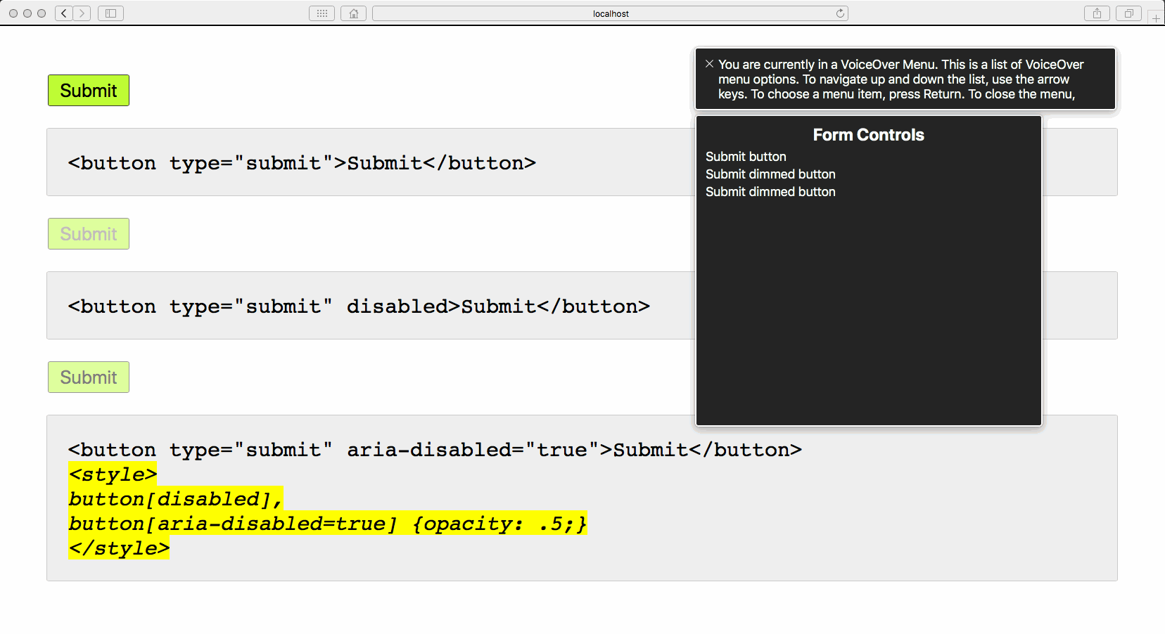
Hint: A button with aria-disabled="true" doesn't look the same as a button with the attribute disabled. So you have to add some CSS to the button, e.g. button[aria-disabled=true] {opacity: .5;}. It's also important to notice that although "disabled" the aria-disabled will be clickable. The user might submit the form anyhow, even if not all your conditions have been fulfilled.
Combining aria-disabled and aria-live
Here's a simple example of a form that not only uses aria-disabled but also some JavaScript to prevent this disabled button to submit the form by accident. On top we're using something called aria-live. You see, in our example the user has to check a checkbox, otherwise the button will not work. As soon as he/she ticks the checkbox the button will be enabled. So something changes within the form. To inform the user of this change we're using aria-live="assertive" on an visually hidden paragraph. With the help of our JavaScript we're changing the hint message within the paragraph and the screen reader will be told to read the change.
Video example
In this video we have a simple form with a disabled button. The user has to tick a checkbox to enable the button. We're using aria-disabled and give feedback with the help of aria-live. This example does not work "out of the box". It'll need some JavaScript.
Hint: There is aria-live="assertive" and there is aria-live="polite". The difference is, that "assertive" will trigger the screen reader to read out the change immediately, whereas the "polite" will wait until the user stops being active within the form (typing or clicking).
How to use aria-live - an example
The above shown example uses this kind of markup:
<form>
    <div>
        <label for="email">Your e-mail</label>
        <input type="email" id="email">
    </div>
    <div>
        <label for="terms">You agree to our terms and policy</label>
        <input type="checkbox" id="terms">
    </div>
    <button  aria-disabled="true">Submit</button>
    <p class="visually-hidden" aria-live="assertive"></p>
</form>
To make it work we could use something like this:
<script>
(function() {
    var form = document.querySelector('form');
    var checkbox = form.querySelector('input[type="checkbox"]');
    var allowed = false;

  form.addEventListener('submit', function(event) {
        if (allowed) {
            console.log('you may pass');
            event.preventDefault(); // needs to be removed in the real world
        }

        if (!allowed) {
            console.log('you shall not pass');
            event.preventDefault();
        }
  });

    function toggleButton() {
        var nonvisualHint = form.querySelector('.visually-hidden');
      var submitButton = form.querySelector('button');
      if (allowed) {
        submitButton.setAttribute('aria-disabled', 'false');
        nonvisualHint.textContent = 'Please hit the submit button to subscribe to our newsletter.';
      } else {
        submitButton.setAttribute('aria-disabled', 'true');
        nonvisualHint.textContent = 'Please check the checkbox and agree to our terms to send this form.';
      }
    }

    toggleButton();
    checkbox.addEventListener('change', function() {
        allowed = checkbox.checked;
    toggleButton();
    });
})();
</script>
(Thanks to Tobias Krogh for the script.)