Icons
Icons may not be enough
There are a few challenges regarding icons on the internet. You’ve put a lot of effort into designing a new set of icons. They stand out from other icons on other pages. The only problem is that no one outside your department understands them. It’s like a joke you have to explain. If you have to explain it, it’s not good. Maybe you should test your icons with ordinary people and see whether they really get their meaning. Would you click on an icon even if you’re not sure what it does?
So you’ve asked ten pedestrians in the street and eight out of ten people understood your icons. Hurray! Let’s go live. But what about the 20% that don’t get it? Do we want to ignore them? Can we afford to ignore them?
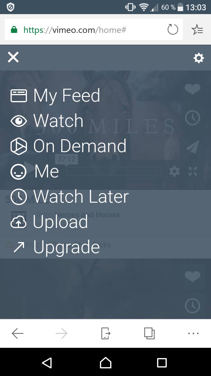
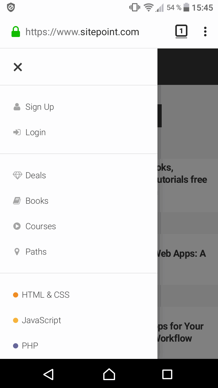
Sometimes it’s better not to rely solely on the iconography, but to add a word as well. I believe my father doesn’t know what these three horizontal lines in the upper right corner mean. And when I tell him that’s a menu, he’d probably shake his head.
I don’t want to mock your design skills. Let’s assume you make the best icons ever. But how many icons can you make? In the end, icons will be re-used all over your page, which leaves us with question marks in our eyes. One icon suddenly has several meanings - do you see where I’m going with this?
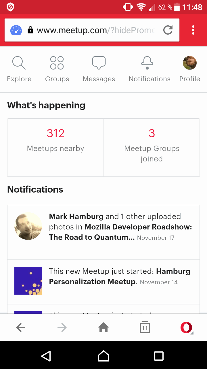
The combination of icons and a corresponding label helps everyone: people with mental impairments, the elderly who aren’t “internet natives”, and even your good self. Yes, that means you have to think differently. Maybe you only have limited space on your page and have to throw out one or two icons to accommodate icons with labels. Focus on the most important interactions and you’re good to go.
Examples for ambiguous icons


In the developer’s section we’ll look further into how we can put labels and icons on the page from a developer perspective.